Prose components are perhaps one of the best features of Nuxt Content.
If not the best, they are certainly my favourite, because they're just so much fun to use.
Through five different examples, I'm going to show you exactly how to use prose components, and a bunch of different things you can do with them.
Prose components let us easily drop in components to render different parts of our Markdown content — p, a and img tags, as well as custom rendering for code blocks and everything else in Markdown.
These are the examples that we'll be exploring, starting simple and then working our way up in complexity:
- Horizontal rule — we'll be adding a custom animation to keep things interesting
- Add filename to code blocks — let's add some useful metadata to our code blocks
-
Super easy lightbox — a simple lightbox that uses
NuxtImgto keep things optimized - Meta-info on links — show the title, description and more on internal links, and show where external links go to
- Highlighting paragraphs — highlight specific paragraphs when you share the URL
You can check out a live demo of these components here and all the code here.
Let's get started, shall we?
1. Horizontal Rule

In Markdown we can create a horizontal rule using three hyphens, ---. This renders the hr tag, which is kind of boring.
With prose components, however, we can make things more fun by rendering this HR component instead:
<!-- components/content/ProseHr.vue -->
<template>
  <div class="flex justify-center space-x-6 text-gray-300">
    <span v-for="n in 5" class="animate-spin">/</span>
  </div>
</template>

<style scoped>
.animate-spin {
  animation-duration: 5s;
}

.animate-spin:nth-child(2) {
  animation-delay: 200ms;
}

.animate-spin:nth-child(3) {
  animation-delay: 400ms;
}

.animate-spin:nth-child(4) {
  animation-delay: 600ms;
}

.animate-spin:nth-child(5) {
  animation-delay: 800ms;
}
</style>
All you need to do is place this file in the components/content/ folder and Nuxt Content will automatically detect it.
Now, it'll be used whenever a <hr> element would be rendered by the Markdown renderer.
But we can do far more than just CSS with this.
2. Filename on code blocks
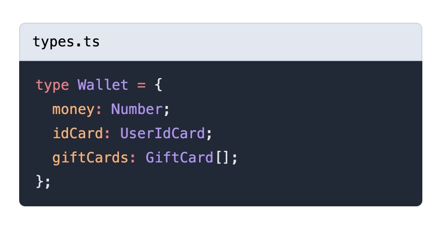
Nuxt Content has a whole long list of the different prose components we can make (yeah, it's a lot).
These are what are used by default internally.
The default code block we get with Nuxt Content does syntax highlighting, but not much else.
We can add a filename to it, so that when we add the filename to our code block in our Markdown, it will show up on the page. The filename is passed to us as one of the many props.
You can see the default pre component on Github, with all of the potential props listed there. You can use these default components as a starting point for developing your own prose components.
So, let's add that filename now:
<template>
  <div
    v-if="$props.filename"
    class="bg-slate-200 font-mono text-sm border
           border-slate-300 py-2 px-3 rounded-t-md text-black"
  >
    {{ $props.filename }}
  </div>
  <pre
    :class="{
      [$props.class as string]: true,
      'mt-0 rounded-t-none': $props.filename,
    }"
  ><slot /></pre>
</template>

<script setup lang="ts">
defineProps({
  code: {
    type: String,
    default: '',
  },
  language: {
    type: String,
    default: null,
  },
  filename: {
    type: String,
    default: null,
  },
  highlights: {
    type: Array as () => number[],
    default: () => [],
  },
  meta: {
    type: String,
    default: null,
  },
  class: {
    type: String,
    default: null,
  },
});
</script>

<style>
pre code .line {
  display: block;
}
</style>
We're using $props.filename to directly access the filename prop in the template.
Then, we use some conditional classes to adjust the border rounding. When the filename is set, we'll need to make the top of the code block square so we don't have any weird gaps.
You may notice the formatting of the pre and slot tags are funny — this is actually necessary. Because the pre tag preserves all whitespace, if we formatted it with newlines those newlines would end up rendered to our page as well.
3. Easy Minimal Lightbox
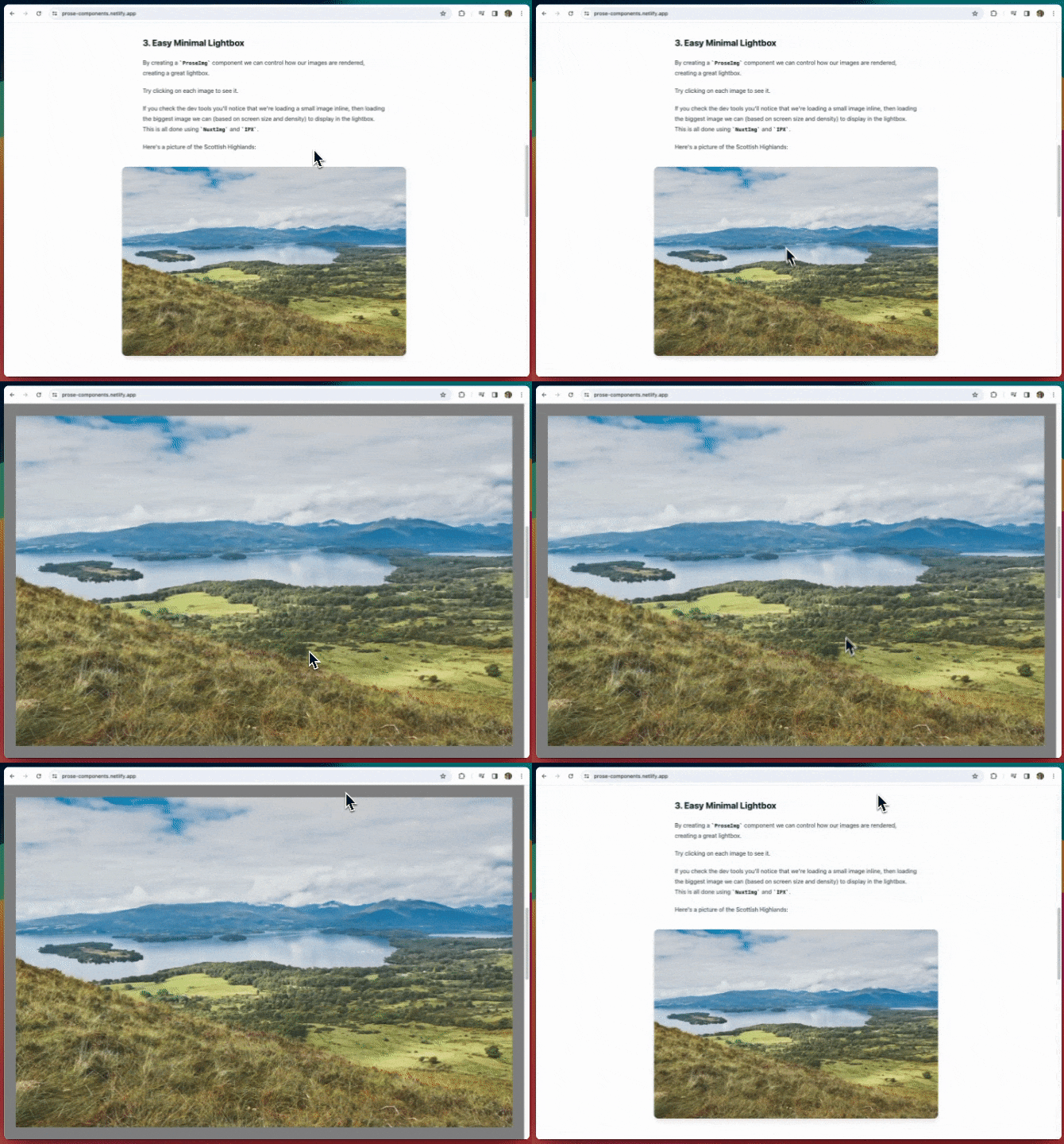
By creating a ProseImg component we can control how our images are rendered, creating a great lightbox.
Try clicking on the images in the demo to see it.
If you check the dev tools you'll notice that we're loading a small image inline, then loading the biggest image we can (based on screen size and density) to display in the lightbox. This is all done using NuxtImg and IPX.
Here's the code for our lightbox component, ProseImg:
<template>
  <div class="p-2 md:-mx-8 lg:-mx-16">
    <NuxtImg
      class="rounded-xl shadow-lg w-full"
      :src="src"
      :alt="alt"
      @click.stop="() => (showLightbox = !showLightbox)"
      width="800"
      sizes="sm:600px md:800px"
      densities="x1 x2"
    />
  </div>
  <Teleport to="body">
    <Transition
      enter-from-class="opacity-0"
      leave-to-class="opacity-0"
    >
      <div
        v-if="showLightbox"
        class="z-10 fixed bottom-0 right-0 top-0 left-0
               bg-black bg-opacity-50 flex items-center
               justify-center backdrop-blur-sm transition-all
               duration-300 md:p-8"
        @click.stop="() => (showLightbox = !showLightbox)"
      >
        <NuxtImg
          :src="src"
          :alt="alt"
          width="6000"
          sizes="sm:600px md:800px lg:1600px xl:6000px"
          densities="x1 x2"
        />
      </div>
    </Transition>
  </Teleport>
</template>

<script setup lang="ts">
defineProps({
  src: {
    type: String,
    default: '',
  },
  alt: {
    type: String,
    default: '',
  },
});

const showLightbox = ref(false);
</script>
There are few interesting things going on in this one.
First, we're using two instances of NuxtImg. We use the first one to render the image in the blog post itself, so we can set that one to be a smaller resolution so it loads quickly:
<NuxtImg
  class="rounded-xl shadow-lg w-full"
  :src="src"
  :alt="alt"
  @click.stop="() => (showLightbox = !showLightbox)"
  width="800"
  sizes="sm:600px md:800px"
  densities="x1 x2"
/>
Then, we use a second NuxtImg for the lightbox. This is so that we can display a full resolution of the image:
<Teleport to="body">
  <Transition
    enter-from-class="opacity-0"
    leave-to-class="opacity-0"
  >
    <div
      v-if="showLightbox"
      class="z-10 fixed bottom-0 right-0 top-0 left-0
              bg-black bg-opacity-50 flex items-center
              justify-center backdrop-blur-sm transition-all
              duration-300 md:p-8"
      @click.stop="() => (showLightbox = !showLightbox)"
    >
      <NuxtImg
        :src="src"
        :alt="alt"
        width="6000"
        sizes="sm:600px md:800px lg:1600px xl:6000px"
        densities="x1 x2"
      />
    </div>
  </Transition>
</Teleport>
We put this inside of Vue's built-in Teleport and Transition components. This is so that we can send it to the very bottom of the body tag, and have a nice transition when opening/closing it.
One neat thing you can do with Tailwind and the Transition component — you can set the classes that should be applied/removed at various points during the transition using enter-from-class and leave-to-class (there are more you can set). This makes it super easy to use Tailwind classes (or any other utility CSS) in your transitions.
4. Meta-data on links
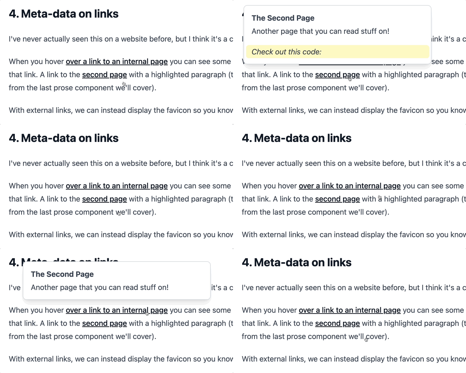
I've never actually seen this on a website before, but I think it's a cool feature.
In the demo, when you hover over a link to an internal page you can see some extra meta-data about that link. With external links, we can instead display the favicon so you know where you're headed.
I'm working on a version of this for my own course platform. There, it also shows if you have access to the specific lesson being linked to or not. This is great since it lets me cross-link between courses for those who have them, but with a nice UX to show you if you don't have access.
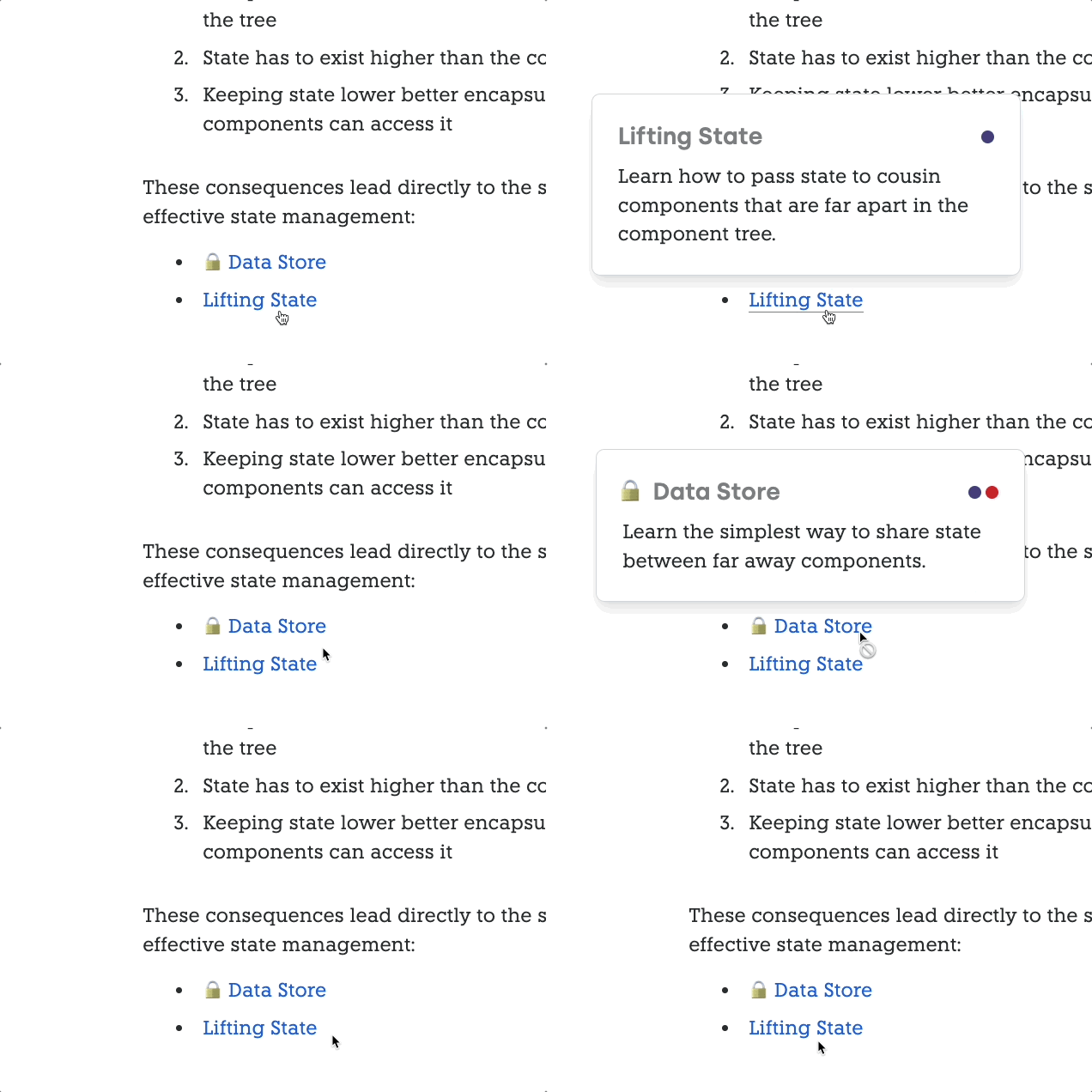
And this also works on my blog posts!
This one is a bit more complicated, so we'll go through it in pieces. Here's the template of the ProseA component:
<template>
  <div class="group inline relative z-0 cursor-pointer">
    <NuxtLink :href="href" :target="target">
      <slot />
    </NuxtLink>
    <div
      v-if="isInternal"
      class="absolute transition-all duration-150 bottom-full
             left-1/2 transform -translate-x-1/2 w-[400px]
             opacity-0 group-hover:opacity-100 pointer-events-none"
    >
      <div
        class="relative bottom-3 w-content bg-gradient-to-br
              from-white to-slate-50 border border-gray-300
              py-3 px-4 shadow-lg rounded-lg overflow-auto"
      >
        <div class="font-bold">{{ metadata.title }}</div>
        <div>{{ metadata.description }}</div>
        <div
          v-if="linkedParagraph"
          class="bg-yellow-100 rounded-md px-3 -mx-3 mt-4 italic"
        >
          {{ linkedParagraph }}
        </div>
      </div>
    </div>

    <template
      v-else-if="!isInternal"
      class="text-xs text-gray-500 font-bold"
    >
      <NuxtImg
        v-if="!showFallbackFavicon"
        class="inline-block -top-[1px] ml-1 relative not-prose"
        :src="faviconUrl"
        @error="showFallbackFavicon = true"
        width="16"
        height="16"
      />
      <span class="text-sm ml-1" v-if="showFallbackFavicon">
        ↗
      </span>
    </template>
  </div>
</template>
The first part is just like the basic ProseA component. We render a NuxtLink using a slot:
<NuxtLink :href="href" :target="target">
  <slot />
</NuxtLink>
Next, we render the section that gets displayed if we have an internalLink:
<div
  v-if="isInternal"
  class="absolute transition-all duration-150 bottom-full
         left-1/2 transform -translate-x-1/2 w-[400px]
         opacity-0 group-hover:opacity-100 pointer-events-none"
>
  <div
    class="relative bottom-3 w-content bg-gradient-to-br
           from-white to-slate-50 border border-gray-300
           py-3 px-4 shadow-lg rounded-lg overflow-auto"
  >
    <div class="font-bold">{{ metadata.title }}</div>
    <div>{{ metadata.description }}</div>
    <div
      v-if="linkedParagraph"
      class="bg-yellow-100 rounded-md px-3 -mx-3 mt-4 italic"
    >
      {{ linkedParagraph }}
    </div>
  </div>
</div>
This is what displays that popover, where we can show the title, description and the linkedParagraph if there is one (we'll get to what that linkedParagraph is with the next prose component).
Nothing too crazy, just a lot of styling to get things to look nice and have a nice transition in there.
The last section is for displaying external links:
<template
  v-else-if="!isInternal"
  class="text-xs text-gray-500 font-bold"
>
  <NuxtImg
    v-if="!showFallbackFavicon"
    class="inline-block -top-[1px] ml-1 relative not-prose"
    :src="faviconUrl"
    @error="showFallbackFavicon = true"
    width="16"
    height="16"
  />
  <span class="text-sm ml-1" v-if="showFallbackFavicon">
    ↗
  </span>
</template>
Here, we're displaying a favicon immediately after the link using NuxtImg again. This is so that we can have our own local cache of the favicons using IPX.
If the favicon cannot be found or loaded for some reason, we fall back to a basic arrow to indicate that this is an external link.
But where do we get all this data?
Here's the script for this component. I won't go into too much detail for this part:
// Get our basic ProseA props
const props = defineProps({
  href: {
    type: String,
    default: '',
  },
  target: {
    type: String,
    default: undefined,
    required: false,
  },
});

const isInternal = computed(() => {
  return props?.href?.startsWith('/') || false;
});

const pathname = computed(() => {
  // Strip off any query or hash
  return props.href.split('?')[0].split('#')[0];
});

// Grab and cache the Nuxt Content document this links to
const nuxtApp = useNuxtApp();
const { data: metadata } = await useAsyncData(
  pathname.value,
  () => queryContent(pathname.value).findOne(),
  {
    dedupe: 'defer',
    getCachedData(key) {
      return (
        nuxtApp.static.data[key] ||
        nuxtApp.payload.data[key]
      );
    },
  }
);

// Get the URL to the favicon
const showFallbackFavicon = ref(false);
const faviconUrl = computed(() => {
  const hostname = new URL(props.href).hostname;
  return encodeURI(
    `https://www.google.com/s2/favicons?domain=${hostname}`
  );
});

// Recursive function to get all text values
function getTextFromNode(node) {
  return (
    node.children
      .flatMap((child) => {
        if (child.type === 'text') {
          return child.value;
        } else {
          return getTextFromNode(child);
        }
      })
      .join(' ')
      // Fix double spaces and some punctuation
      .replaceAll('  ', ' ')
      .replaceAll(' .', '.')
  );
}

// Figure out what paragraph the hash is highlighting
const linkedParagraph = computed(() => {
  if (props.href.includes('?')) {
    const hash = props.href.split('?').at(-1);
    const paragraphs = metadata.value.body.children
      .filter(({ tag }) => tag === 'p')
      .map(getTextFromNode);

    const p = paragraphs.find((p) => {
      const pHash = p
        .split(' ')
        .map((word) => word[0])
        .join('');

      return hash.includes(pHash);
    });

    return p;
  }
});
Now let's take a look at these "linked paragraphs" I've been mentioning.
5. Share highlighted paragraphs
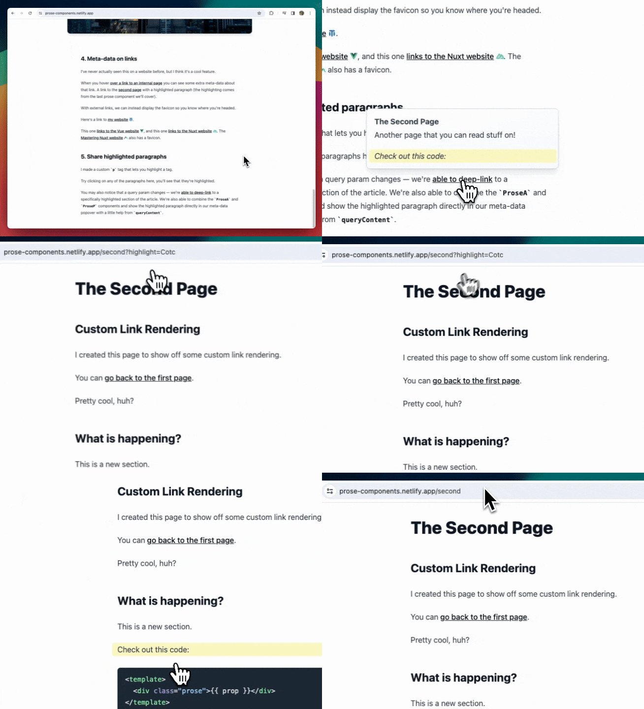
I made a custom p tag that lets you highlight a tag.
Try clicking on any of the paragraphs in the demo, and you'll see that they get highlighted.
You may also notice that a query param changes — we're able to deep-link to a specifically highlighted section of the article. We're also able to combine the ProseA and ProseP components and show the highlighted paragraph directly in our meta-data popover with a little help from queryContent.
The template for this ProseP component is quite simple:
<template>
  <div
    class="cursor-pointer transition-all duration-150 ease-in-out"
    :class="{
      'bg-yellow-100 rounded-md px-3 -mx-3': isHighlighted,
    }"
    @click="toggleHighlight"
  >
    <p ref="el">
      <slot />
    </p>
  </div>
</template>
Essentially, we just need to wrap the p tag in a div so that we can style it properly so the highlight can extend past the sides. Pretty straightforward, at least for the template.
The script is where things get complicated.
Here's the full thing, but we'll go through it piece by piece to explain what's going on:
function getTextFromVNode(vnode) {
  if (typeof vnode.children === 'string') {
    return vnode.children;
  } else if (vnode.children.default) {
    const nodes = vnode.children.default();
    return nodes.map(getTextFromVNode).join('');
  }
}

// Get a "hash" of the content
const slots = useSlots();
const hash = computed(() => {
  return slots
    .default()
    .map(getTextFromVNode)
    .join('')
    .split(' ')
    .map((word) => word[0])
    .join('');
});

const route = useRoute();
const isHighlighted = ref(false);
const el = ref(null);

// We need to rely entirely on side-effects here because
// the hash doesn't exist on the server
watch(
  () => route.query,
  () => {
    checkHash();
  }
);
onMounted(() => {
  checkHash();

  // Scroll to the highlighted element
  if (isHighlighted.value && el.value) {
    el.value.scrollIntoView({ behavior: 'smooth' });
  }
});

const checkHash = () => {
  isHighlighted.value =
    route.query.highlight === hash.value;
};

async function toggleHighlight(event) {
  // Make sure we clicked on a paragraph element
  if (event.target.tagName !== 'P') {
    return;
  }

  if (hash.value === '') {
    return;
  }

  if (isHighlighted.value) {
    isHighlighted.value = false;
    await navigateTo({ replace: true });
  } else {
    isHighlighted.value = true;
    await navigateTo(
      { query: { highlight: hash.value } },
      { replace: true }
    );
  }
}
The main "trick" here is that we need some way of knowing which paragraph should be highlighted. Because each ProseP component is completely isolated, this also needs to be done in a way that each component can determine this completely on it's own.
However, we can share global state through the URL in the form of query parameters — probably one of the best places to put global state.
But paragraphs can get long, so instead of shoving the entire thing into a query param, we'll just take the first letter of each word.
So we might have a URL like this:
https://prose-components.netlify.app/second?highlight=Cotc
This highlights the paragraph with the text, "Check out this code".
To calculate what this "hash" is for each paragraph, we have two main things going on:
function getTextFromVNode(vnode) {
  if (typeof vnode.children === 'string') {
    return vnode.children;
  } else if (vnode.children.default) {
    const nodes = vnode.children.default();
    return nodes.map(getTextFromVNode).join('');
  }
}

// Get a "hash" of the content
const slots = useSlots();
const hash = computed(() => {
  return slots
    .default()
    .map(getTextFromVNode)
    .join('')
    .split(' ')
    .map((word) => word[0])
    .join('');
});
The getTextFromVNode function recursively grabs the text content from a VNode. We can then use this on the default slot of our p tag.
Once we have all the text fragments, we combine them, then split based on the word and grab the first letter of each word using map((word) => word[0]).
Whenever we click on this p tag, we run an event handler:
async function toggleHighlight(event) {
  // Make sure we clicked on a paragraph element
  if (event.target.tagName !== 'P') {
    return;
  }

  if (hash.value === '') {
    return;
  }

  if (isHighlighted.value) {
    isHighlighted.value = false;
    await navigateTo({ replace: true });
  } else {
    isHighlighted.value = true;
    await navigateTo(
      { query: { highlight: hash.value } },
      { replace: true }
    );
  }
}
Here, we first make sure we didn't click on a descendant element like an img tag or something like that. We only want to highlight text paragraphs.
Then, we toggle the isHighlighted value and update our URL/route query param.
But we have a problem here, since a previously highlighted paragraph won't know if another one has been clicked. We have to communicate to all the paragraphs that there's a new paragraph that has been highlighted.
We can do this through the route itself — our global state.
That's what the middle chunk of logic does. We're watching for route changes (and also calling onMounted) to make sure each paragraph stays in sync:
const route = useRoute();
const isHighlighted = ref(false);
const el = ref(null);

// We need to rely entirely on side-effects here because
// the hash doesn't exist on the server
watch(
  () => route.query,
  () => {
    checkHash();
  }
);
onMounted(() => {
  checkHash();

  // Scroll to the highlighted element
  if (isHighlighted.value && el.value) {
    el.value.scrollIntoView({ behavior: 'smooth' });
  }
});

const checkHash = () => {
  isHighlighted.value =
    route.query.highlight === hash.value;
};
By putting a watch on the route, we're able to make sure that only the current paragraph stays highlighted as we click around on our page.
But we're not done here.
Well, this ProseP component is finished, but we can also display this highlighted paragraph in our link metadata popover.
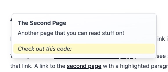
In our ProseA component we have this chunk of logic:
// Recursive function to get all text values
function getTextFromNode(node) {
  return (
    node.children
      .flatMap((child) => {
        if (child.type === 'text') {
          return child.value;
        } else {
          return getTextFromNode(child);
        }
      })
      .join(' ')
      // Fix double spaces and some punctuation
      .replaceAll('  ', ' ')
      .replaceAll(' .', '.')
  );
}

// Figure out what paragraph the hash is highlighting
const linkedParagraph = computed(() => {
  if (props.href.includes('?')) {
    const hash = props.href.split('?').at(-1);
    const paragraphs = metadata.value.body.children
      .filter(({ tag }) => tag === 'p')
      .map(getTextFromNode);

    const p = paragraphs.find((p) => {
      const pHash = p
        .split(' ')
        .map((word) => word[0])
        .join('');

      return hash.includes(pHash);
    });

    return p;
  }
});
The getTextFromNode is similar to our other getTextFromVNode function, but instead of operating on vnodes, it operates on the parsed and transformed nodes we get back from Nuxt Content.
Then we have a computed ref, linkedParagraph, that calculates the hash of each paragraph and compares it to the query parameter. This lets us figure out which paragraph is being linked to on the other page.
Conclusion
By now you should understand the potential (and fun!) of using prose components in your Nuxt Content project.
They're super easy to set up and get going, but the possibilities are endless.
This article took me way too long to write, because I kept finding fun things to add on, and kept tinkering with my code.
In fact, I may keep tinkering because there are a lot of ideas I just didn't get a chance to explore...


