
To give your users the best possible experience on your Nuxt site, you should be optimizing for the most commonly used devices that use it. For most of us, thats mobile and desktop.
Usually companies start out by picking their most popular device profile and code against that. Then, responsive design is used to adjust the display for the secondary device. This is probably fine for most websites, but for some, they run into trouble with the size of their markup. What happens when you have a giant mega-menu on desktop and a totally different menu for phones?
It gets even more complicated when your site needs to be dynamic and uses server-side rendering! You want to give your users the right content for their device, but how do you manage that with server-side rendering?
Old Trusty - User Agent Parsing
One way to give your users the right experience on the first hit is by doing mobile detection server side. The technique uses an ancient technology: user agents.
Whenever your browser goes to a site, it sends along a description of the browser you are using. It varies based on the browser, device, and operating system. Here are some examples:
Macbook Pro / Chrome
Mozilla/5.0 (Macintosh; Intel Mac OS X 10_15_7) AppleWebKit/537.36 (KHTML, like Gecko) Chrome/90.0.4430.212 Safari/537.36
Macbook Pro / Safari
Mozilla/5.0 (Macintosh; Intel Mac OS X 10_15_7) AppleWebKit/605.1.15 (KHTML, like Gecko) Version/14.0 Safari/605.1.15
IPhone SE (Latest) / Safari
Mozilla/5.0 (iPhone; CPU iPhone OS 14_4_2 like Mac OS X) AppleWebKit/605.1.15 (KHTML, like Gecko) Version/14.0.3 Mobile/15E148 Safari/604.1
What you can do is parse this information and tell what browser is being used, it's version, and in most cases if the user is on a phone, tablet, or desktop device. At work we use a basic library called mobile-detect. Really, it's just a bunch of regular expressions that are used to match your user agent string. It actually works fairly well.
Here is a simple server side plugin and store that can detect if you are mobile, desktop, or a tablet.
// plugins/device.server.js

import MobileDetect from 'mobile-detect'

export default({ req, store }) => {
  const md = new MobileDetect(req.headers['user-agent'])
  const isMobile = md.phone() !== null || md.mobile() === 'UnknownMobile'
  const isTablet = md.tablet() !== null || md.mobile() === 'UnknownTablet'
  const isDesktop = !isMobile && !isTablet

  store.commit('setDevice', {
    isMobile,
    isTablet,
    isDesktop,
  })
}
// store/index.js
export const state = () => ({
  device: {}
})

export const mutations = {
  setDevice(state, value){
    state.device = value
  }
}
You can use this information to load the appropriate experience for the current page being rendered by leverage v-ifs and lazy loading.
Pros
- Easy to setup
- Works on first hit
- Works on both server and client (user agents)
Cons
- Needs updates
- Sometimes wrong (iPad vs iPad Pro)
When I mentioned this was "ancient technology" I wasn't too far from the truth, user agents have been sent from browsers since the beginning of the modern internet.
The New Kid - Client Hints
In recent years there has been a new way to get detailed information from the browser so you can update your experience, they are called client hints.
Client hints are browser properties that your server requests to receive when it first talks to your browser. The way it works is on first hit your server sends either HTTP Accept-CH headers, or a http-equiv meta tag that describes the hints it wants. Then on all other hits thereafter, those extra hints get sent with the requests.
Here, we're asking the browser via HTTP headers to send the viewport width along with the estimated connection speed.
// using the HTTP header and a server side plugin
export default({ req,res }) => {
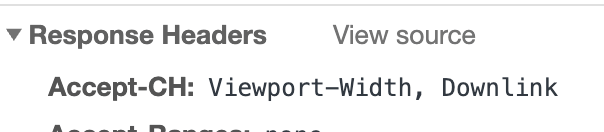
res.setHeader('Accept-CH', 'Viewport-Width, Downlink')
}
You can see our plugin telling the browser what it wants inside the first response.
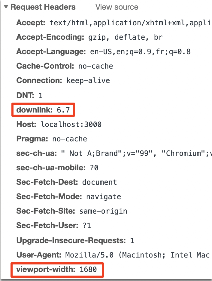
Then, we can see the browser sending the information in the next server side hits.
This is great, now we don't have to parse cryptic and ancient user agent strings. We can get the info we need right from the headers! There are many more device properties available.
Pros
- Direct and detailed information
- Very easy to setup
Cons
- Only supported by Chrome/Edge/Opera
- Not useful for first hits
- Values are rounded/estimated to prevent device fingerprinting
But what about...
There are other ways to get browser information, but many are client-side only.
Feature Detection
This technique is used client-side to detect device properties since they are readily available in javascript from inside the browser. You can use tools like modernizr to decide which features to offer your users instead of a binary mobile vs desktop experience.
CDN Device Detection
Some content distribution networks (CDN) like Akamai and Cloudflare can detect your device and include it in headers being sent to your site. Capabilities and device detection techniques vary and may require enterprise plans.
Wrapping It Up
When using Nuxt (or really any other server side rendering framework), getting the right experience to the right users can really be challenging. The top two techniques outlined above definitely have their advantages, it really depends on the type of devices that visit your site and new vs returning users.